How to Keep AI-Generated Images On Brand: A Practical Guide
Learn how to maintain brand consistency when using AI image generators — covering color control, typography rules, reference images, and systematic brand kit workflows.
AI image generators can produce stunning visuals in seconds. But without deliberate brand controls, every image looks like it was made by a different designer. Colors drift, typography disappears, and the visual identity that took months to build gets diluted across random AI outputs.
Keeping AI-generated images on brand is not a creative problem — it is a systems problem. This guide covers the practical workflow for maintaining visual consistency across AI-generated content.
Why Brand Consistency Matters for AI Content
When you create content manually, brand consistency is enforced through design files, style guides, and muscle memory. The designer knows the hex codes, the approved fonts, and the visual language.
AI generators do not know any of this. Without explicit constraints, they produce images based on statistical patterns from their training data, not your brand guidelines. The result is content that might look good in isolation but feels disconnected from everything else you publish.
The consequences compound:
- Audience confusion — inconsistent visuals erode recognition. People stop associating your content with your brand.
- Wasted production time — you spend more time fixing AI outputs than you saved by generating them.
- Diluted brand equity — every off-brand image weakens the visual identity you invested in building.
The Brand System Approach
Instead of trying to control AI outputs on a per-image basis, build a brand system that applies constraints automatically. This system has four components:
1. Color Palette Definition
Define your exact brand colors — primary, secondary, accent, and neutral tones — as hex codes. When generating images, these colors should be referenced explicitly rather than described vaguely.
Bad prompt: "Use a warm orange tone" Better prompt: "Use #FF6D38 as the primary accent color"
Most AI generators respect specific color references better than descriptive language. The more precise you are, the less the model guesses.
2. Typography Rules
AI image generators struggle with typography. Text in generated images is often garbled, inconsistent, or uses random fonts. The solution is to separate text from image generation:
- Generate the visual elements with AI
- Add typography in a dedicated layout step using your brand fonts
- Never rely on the AI to match your font family, weight, or size
This separation ensures your headlines, body copy, and captions are always pixel-perfect and on-brand.
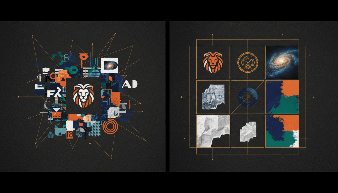
3. Reference Image Libraries
The most effective way to steer AI generation toward your brand aesthetic is through reference images. Build a small library (5-20 images) that represent your visual style:
- Color treatments you want to replicate
- Composition styles that match your brand
- Mood and lighting references
- Examples of on-brand vs. off-brand output
When you generate new content, include reference images to anchor the AI's output closer to your established look.
4. Prompt Templates
Create reusable prompt templates for recurring content types: social media posts, blog headers, product shots, and marketing assets. Each template should encode your brand constraints — colors, mood, composition style, and quality expectations — so you only need to swap in the specific content details.
Building a Brand Kit for AI Workflows
A brand kit is the single source of truth that makes all of this practical. Instead of remembering hex codes and reference images for every generation, you store them once and apply them systematically.
A complete brand kit for AI content workflows includes:
- Primary logo in SVG or PNG with transparent background
- Color palette with hex codes for primary, secondary, accent, and neutral tones
- Font specifications — families, weights, and sizes for headlines, body text, and captions
- Mood descriptors — 3 to 5 adjectives that describe the brand look (e.g., minimal, warm, professional)
- Reference images — 5 to 10 images that represent the target aesthetic
- Anti-references — examples of what the brand should NOT look like
Morphica's brand kits let you store all of these elements and apply them automatically during image generation. Your colors, logos, and visual style are encoded into every generation without manual re-entry.
Common Brand Consistency Mistakes
Describing Colors Instead of Specifying Them
"Make it blue" gives the AI freedom to pick any shade from navy to electric. Always provide exact color values.
Over-Relying on a Single Generation
AI outputs vary significantly across runs. Generate 3 to 5 variations, then select the one closest to your brand. One generation is never enough to ensure quality and consistency.
Ignoring Composition Patterns
Brands have visual rhythms — recurring compositions, framing styles, and spatial patterns. If your brand uses centered, symmetrical layouts, a suddenly asymmetric AI image will feel off-brand even if the colors are correct.
Mixing AI Models Without Calibration
Different AI models have different aesthetic defaults. If you switch between models without adjusting your brand constraints, the outputs will look inconsistent. Calibrate your prompts and references for each model you use.
Skipping Quality Review
Speed is one of AI's advantages, but it should not mean skipping review. Every AI-generated image should be checked against brand guidelines before publishing. A 30-second review catches the problems that erode trust over time.
Workflow: From Brief to On-Brand Image
Here is a practical workflow for producing brand-consistent AI images:
- Start with the brief — What is the image for? What platform? What dimensions? What message should it carry?
- Select the brand kit — Load your stored brand colors, references, and mood settings
- Write the prompt — Use your template as a base, customizing the specific content details
- Generate variations — Produce 3 to 5 options
- Select and review — Choose the closest match to your brand, checking colors, composition, and mood
- Refine if needed — Adjust specific elements through editing or regeneration
- Add typography — Layer in text using your brand fonts in a separate design step
- Final check — Verify the complete asset against your brand guidelines before publishing
This workflow adds roughly 2 to 3 minutes compared to just prompting and publishing, but it prevents the visual inconsistency that damages brand perception over weeks and months.
Measuring Brand Consistency
Brand consistency is not a subjective feeling — you can measure it:
- Visual audit — Lay out your last 20 published images in a grid. Do they look like they belong to the same brand? If three or more stand out as visually different, you have a consistency problem.
- Color sampling — Use a color picker on your published images. Are the dominant colors within your defined palette? Off-palette drift is a clear signal of weak constraints.
- Recognition test — Show your content to someone unfamiliar with your brand, mixed in with competitor content. Can they identify which images are yours? If not, your visual identity is too weak.
- Production time tracking — If you are spending more time fixing AI outputs than creating them, your brand constraints are not specific enough. Better upfront constraints reduce downstream editing.
Scaling Brand Consistency Across Teams
Individual consistency is manageable. Team-wide consistency is where most brands fail. When multiple people are generating AI content:
- Store the brand kit in a shared, accessible location — not in one person's saved prompts
- Create documented prompt templates that anyone on the team can use
- Establish a review step before publishing where output is checked against the brand kit
- Schedule monthly brand audits to catch drift before it compounds
The goal is to make on-brand output the path of least resistance. If following brand guidelines requires extra effort, people will skip them under time pressure. If following guidelines is the default — because the brand kit is loaded automatically — consistency becomes effortless.
With tools like Morphica, brand kits are applied at the generation level, so every team member produces on-brand content without needing to memorize hex codes or reference images.